
Page builder
Styling and responsive design.
Set layout, spacing, typography and background per element – separately for desktop, tablet and mobile, and for hover and press.
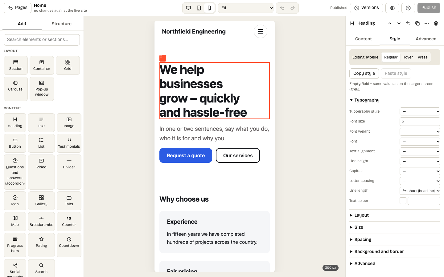
The Style panel with the Mobile screen selected
Select an element and open the Style panel: layout, size, spacing, typography and background.
Desktop, tablet, mobile
At the top of the panel switch Desktop / Tablet / Mobile. A value set for a smaller screen overrides the larger one only there – tablet applies up to 1023 px, mobile up to 767 px.
Hover and press
The Hover and Press toggles set the look on mouse hover (and keyboard focus) and while pressed – separately for tablet and mobile too.
Faster styling
- A typography style (Main title, Section heading, Lead…) sets the font in one choice. The styles themselves are defined in Site appearance.
- Compose a shadow or border with the pencil ✎ next to the field.
- Grids have a grid editor: columns, rows and named areas.
- Copy style / Paste style moves the look from one element to another.
When the same look repeats, do not copy it around – give the elements a shared class instead.